BAU.
Sounds is the fairly new radio, music and podcast offering from the BBC.
As a new app, we are constantly building and improving the experience for audiences across the world.
This brief was to improve on the download experience and how to better tell users what is or isn't happening with their downloads.
The pains.
From previous research, UX workshops and App store reviews; we understood the challenges for our audiences.
01
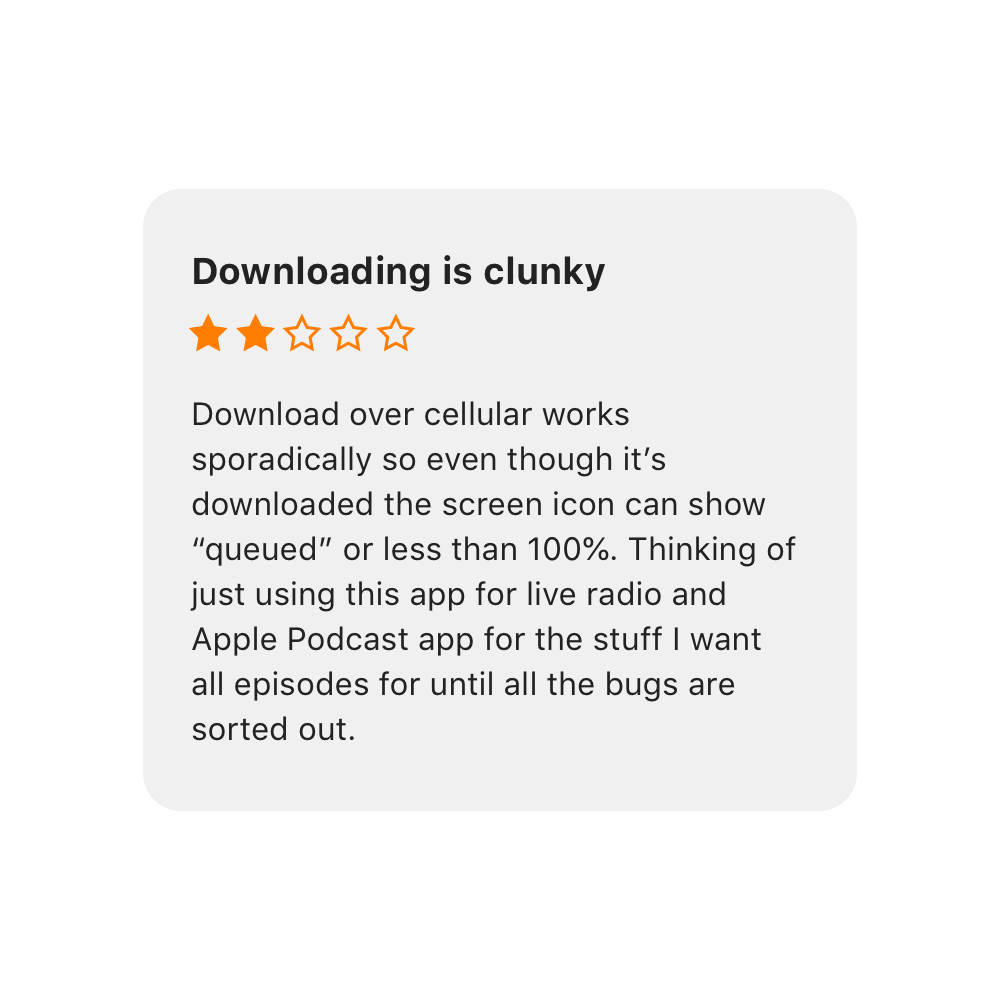
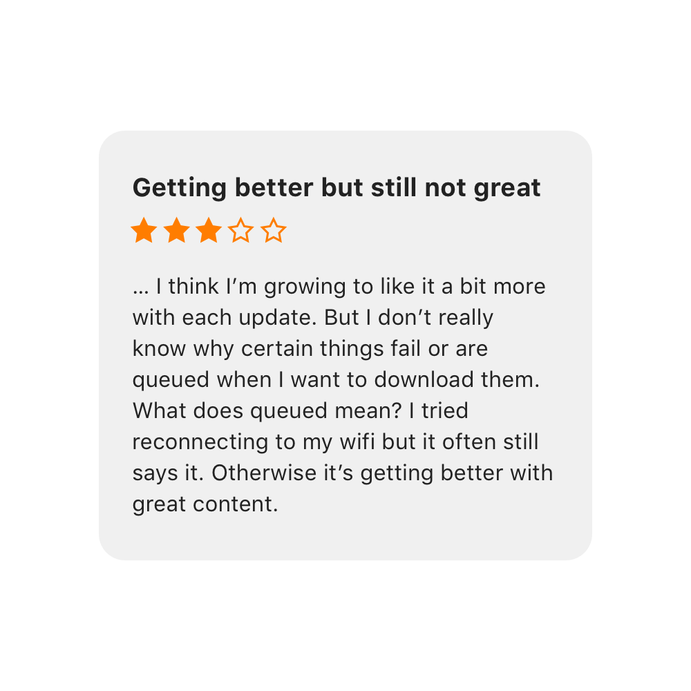
It isn't clear why a download is 'queued'
02
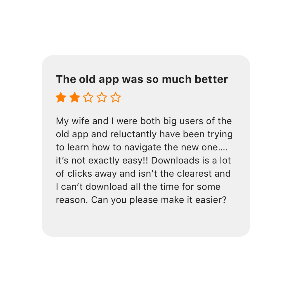
The downloads section isn't the best experience yet
03
It isn't obvious if and why my podcast hasn't downloaded
Brutal. Fair.
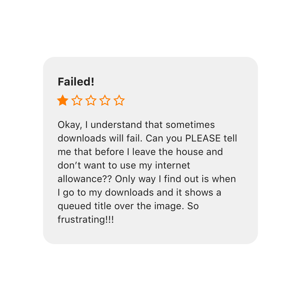
Although sometimes brutal, we learn a lot from our reviews and they help drive us to meet solutions to the problems our users face regularly.
Here are a few where we are getting it wrong.
The others.
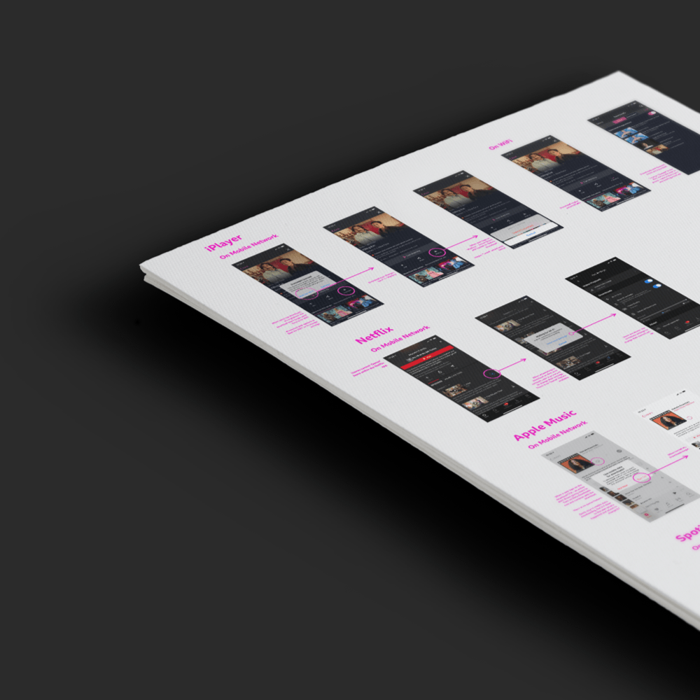
To start, I looked at other products to see what worked and what didn't work in their experiences.
Downloading shouldn't be worlds away from what our users already know.
Understanding.
I spent time understanding XR (cross reality) spaces; spacial computing, multimodal interactions as well as learnings from existing BBC XR projects. Here are a collection of my thoughts.
There's more in a PDF.
Buckle up.
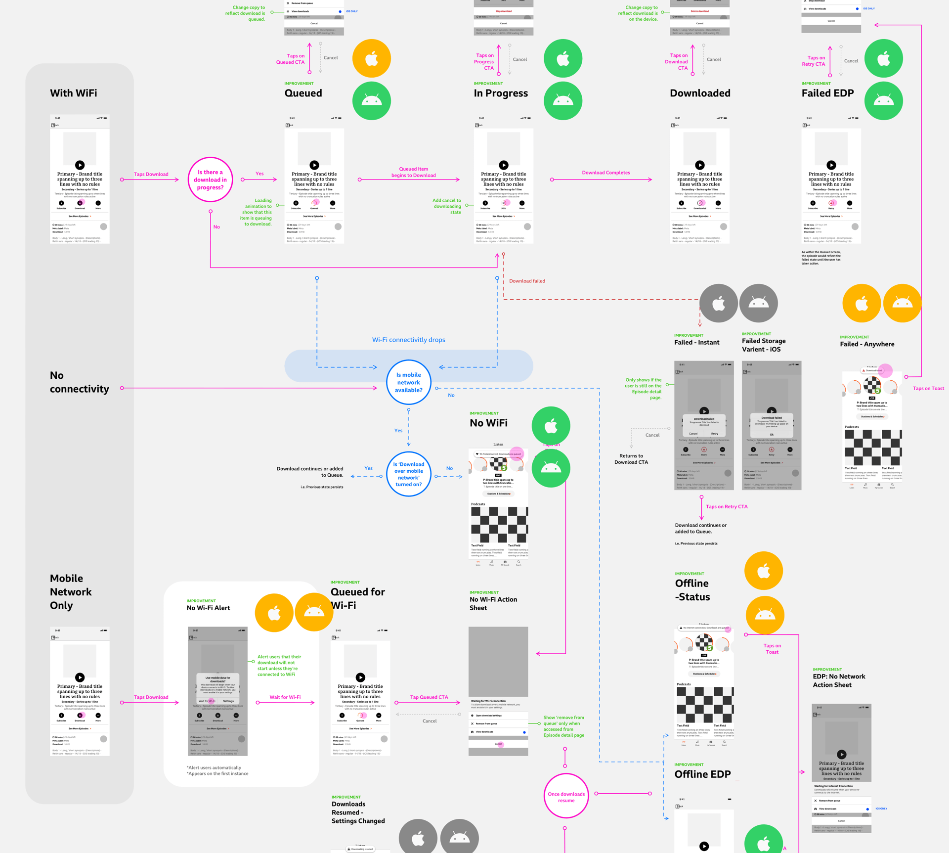
The journey isn't simple. I had to unpick how downloads currently works and identify opportunities to improve the downloading experience - both on Wifi and using cellular.
The focus.
I identified three areas to improve our messaging for downloading.
01
EDP
The Episode Detail Page shows the episode and is the only place where you can download content.
02
Global Messaging
An opportunity to inform users on their download status no matter where they are in the app.
02
Download Space
Where downloads live. How might we make it clearer to users what's what?
01
Episode Detail Page
The heart of the download experience, the EDP is the first interaction our users take when downloading content to their devices.
Current.
Various states within the current experience.
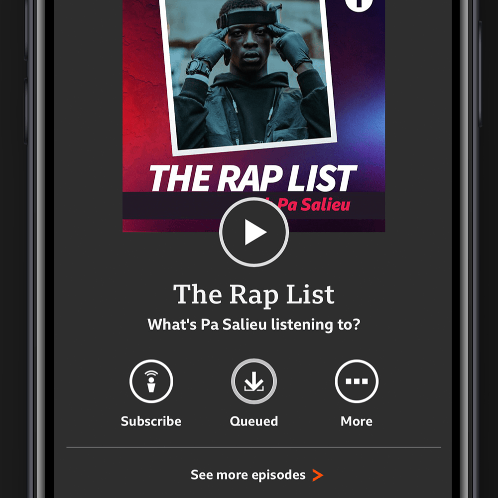

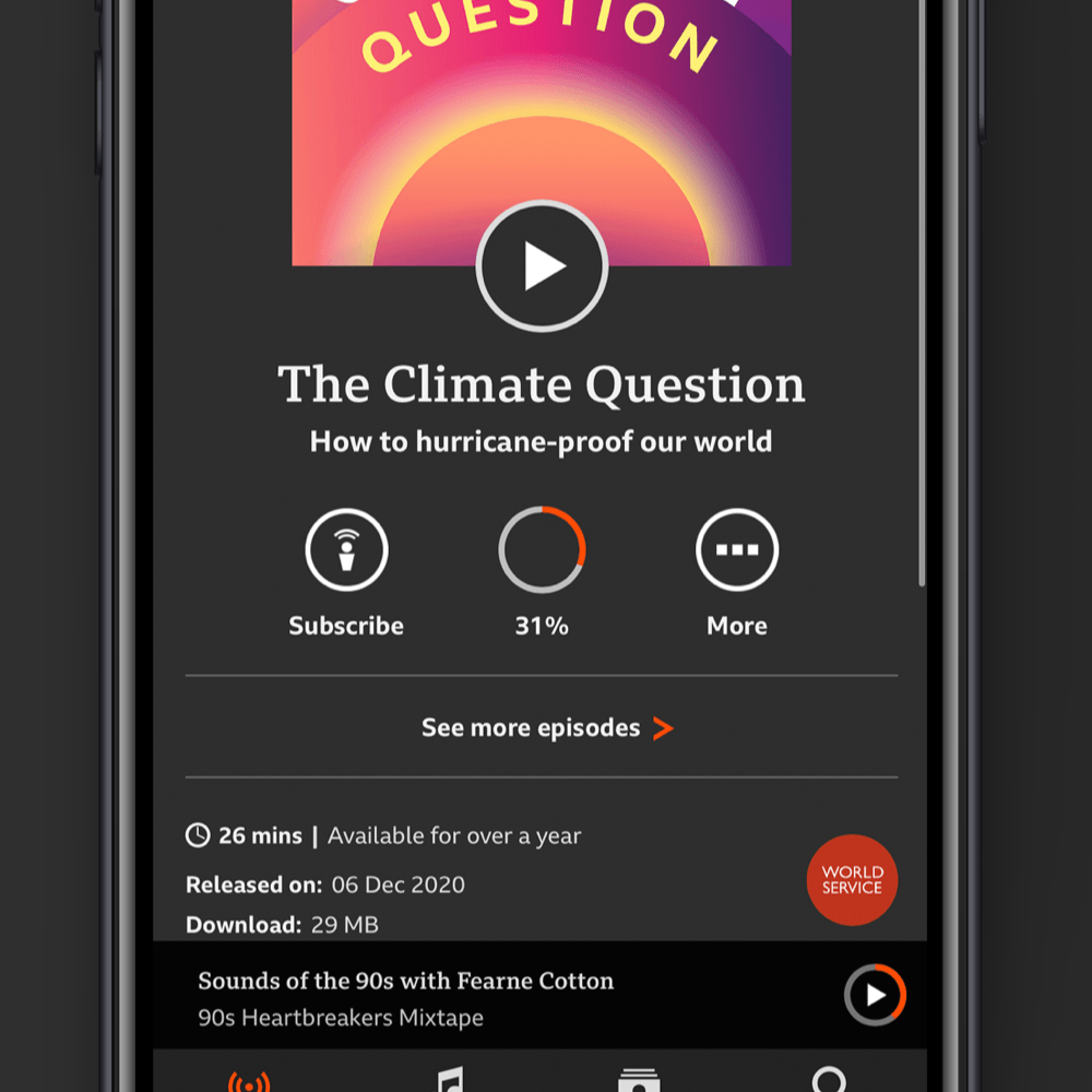
Quick fixes:
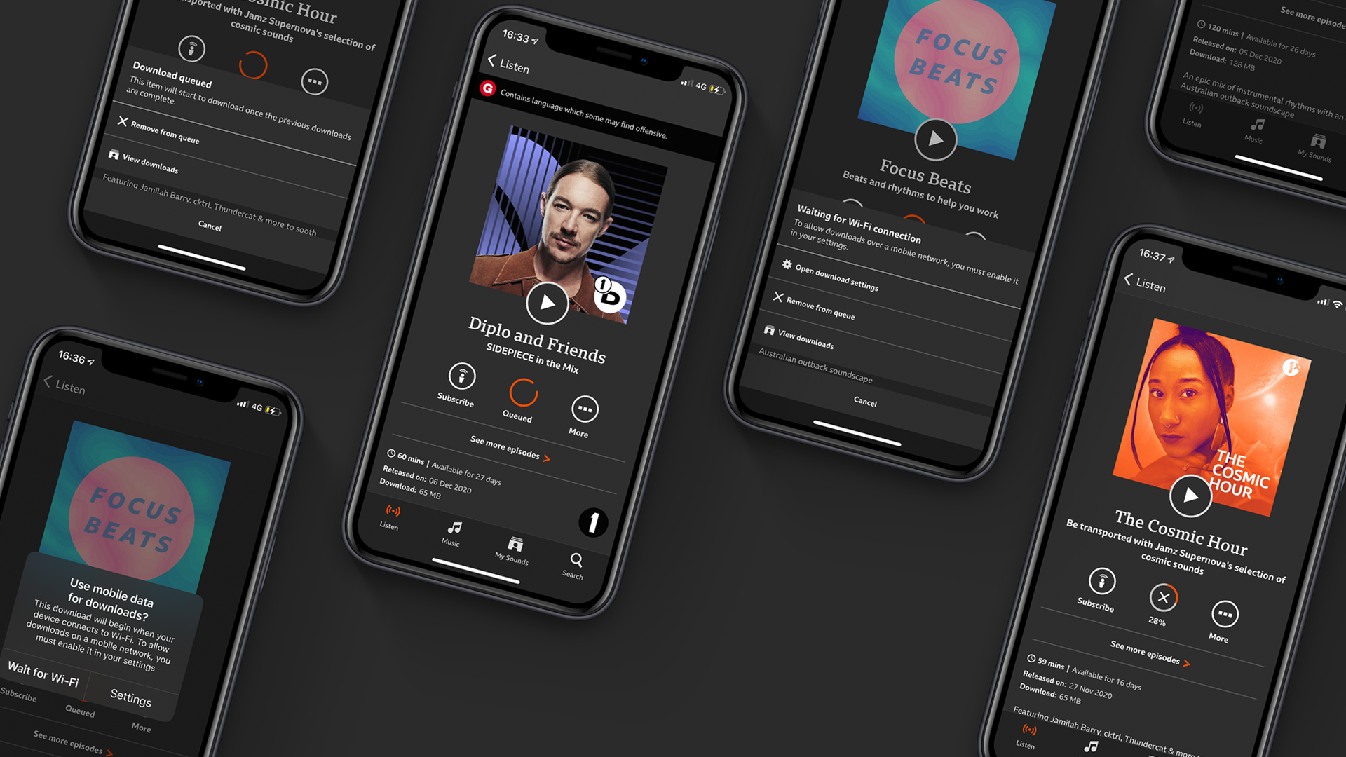
Clearer touch point for users.

Obvious failed content.

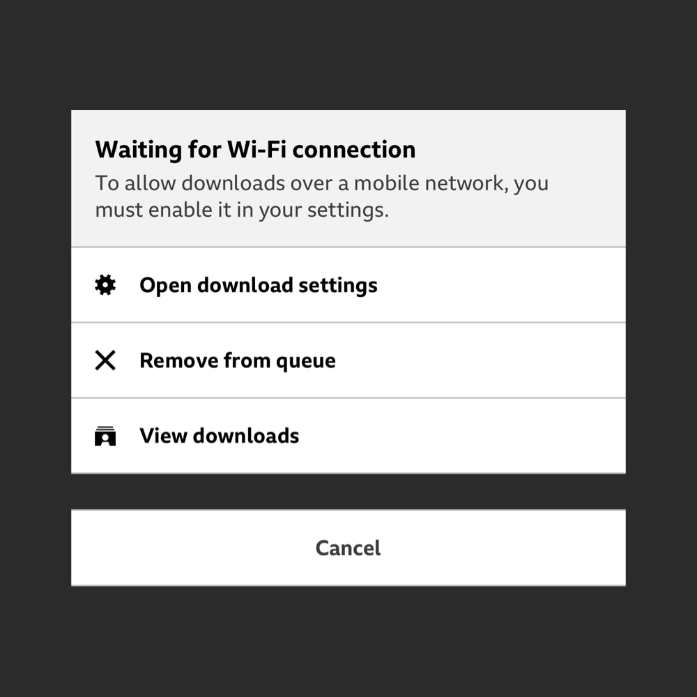
No WiFi? No worries.
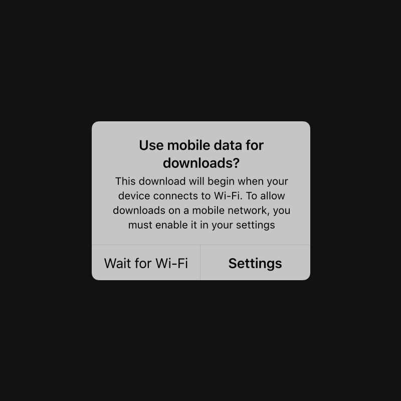
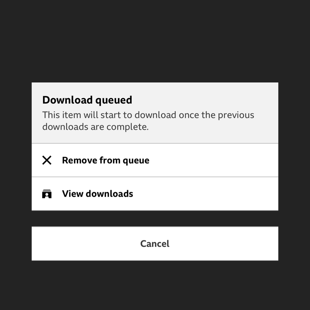
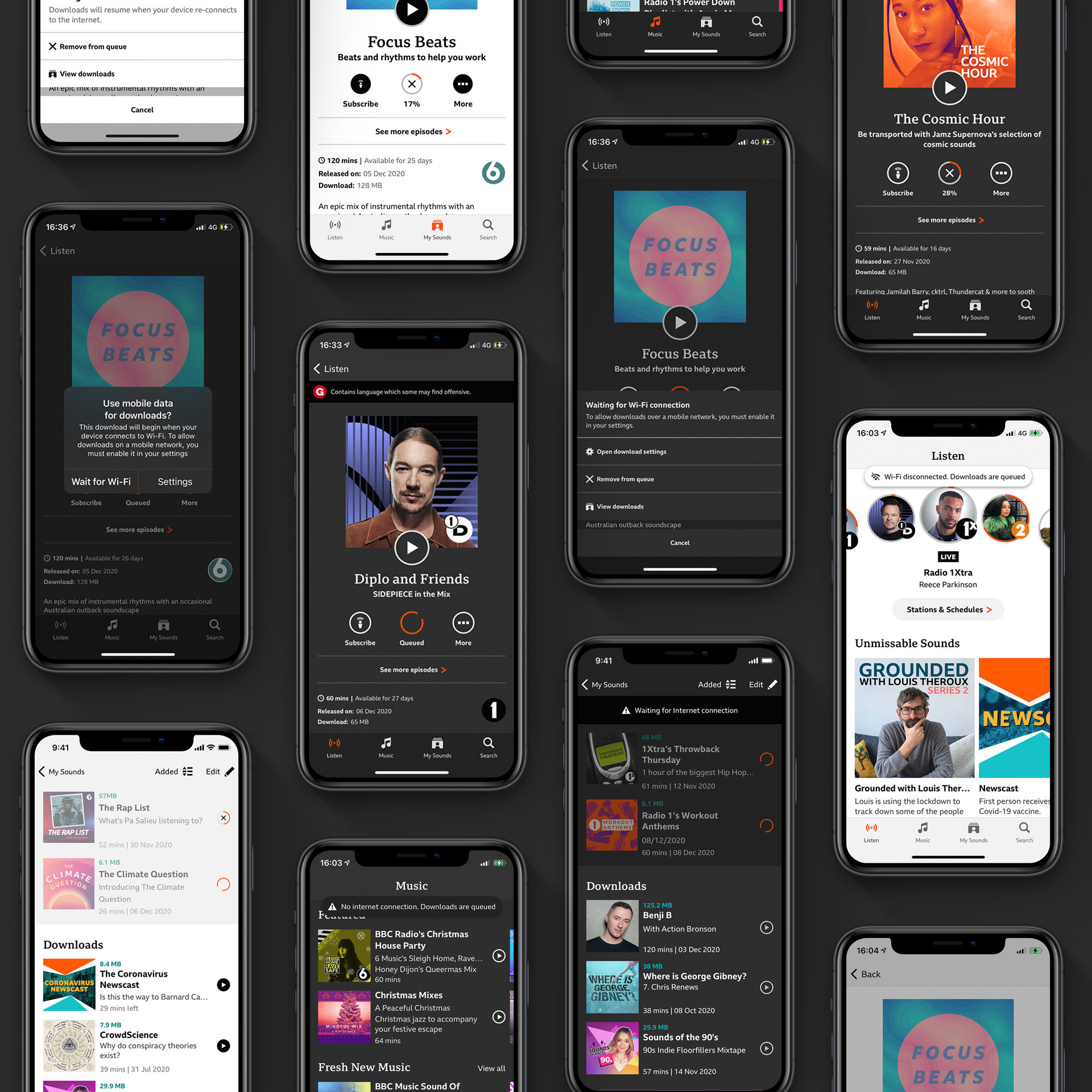
Queued for download.

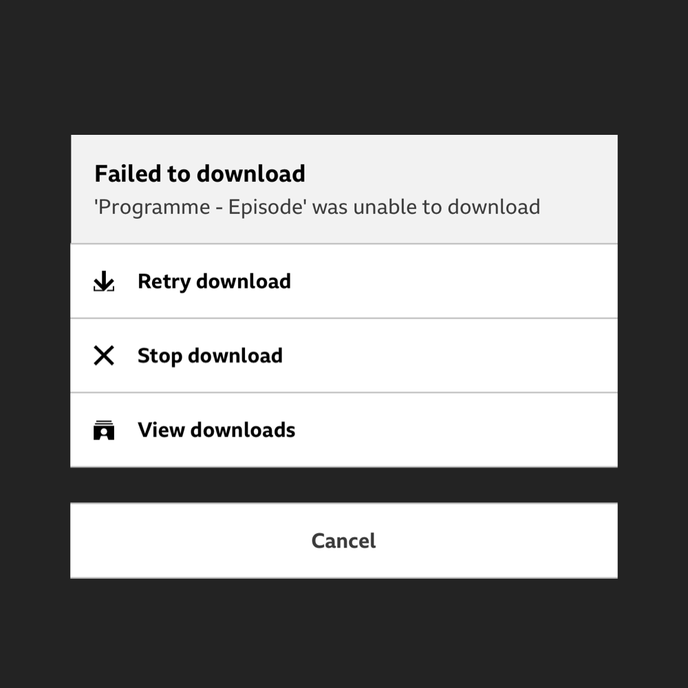
& More informed Action Sheets
02
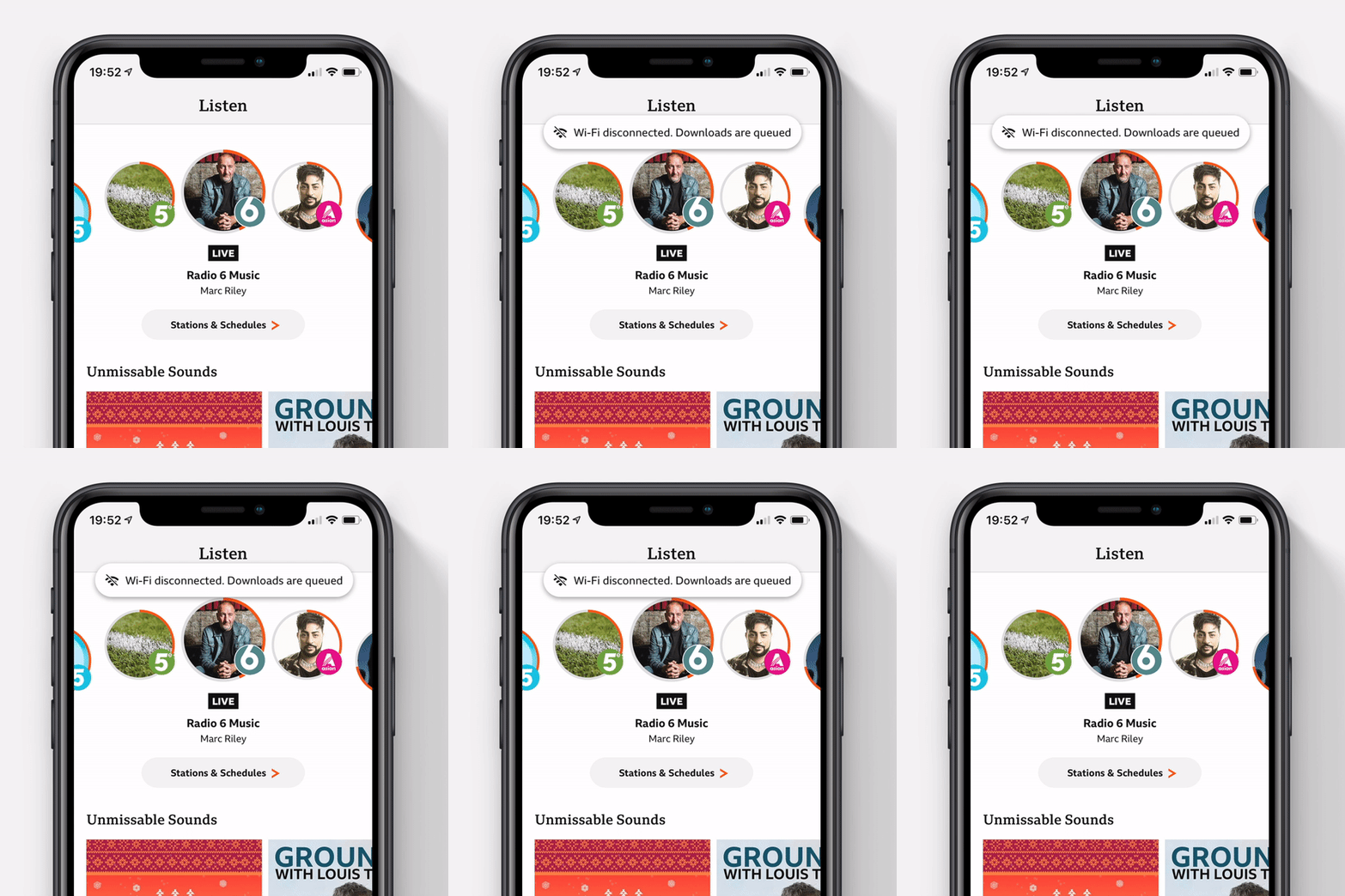
Global Messaging.
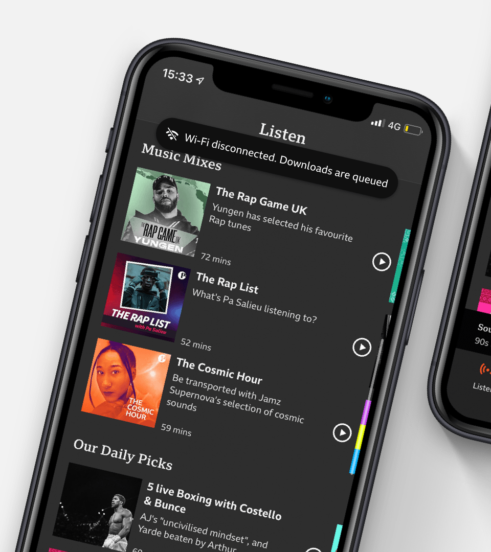
A new pattern to tell users if their download status has changed no matter where they are in the app.
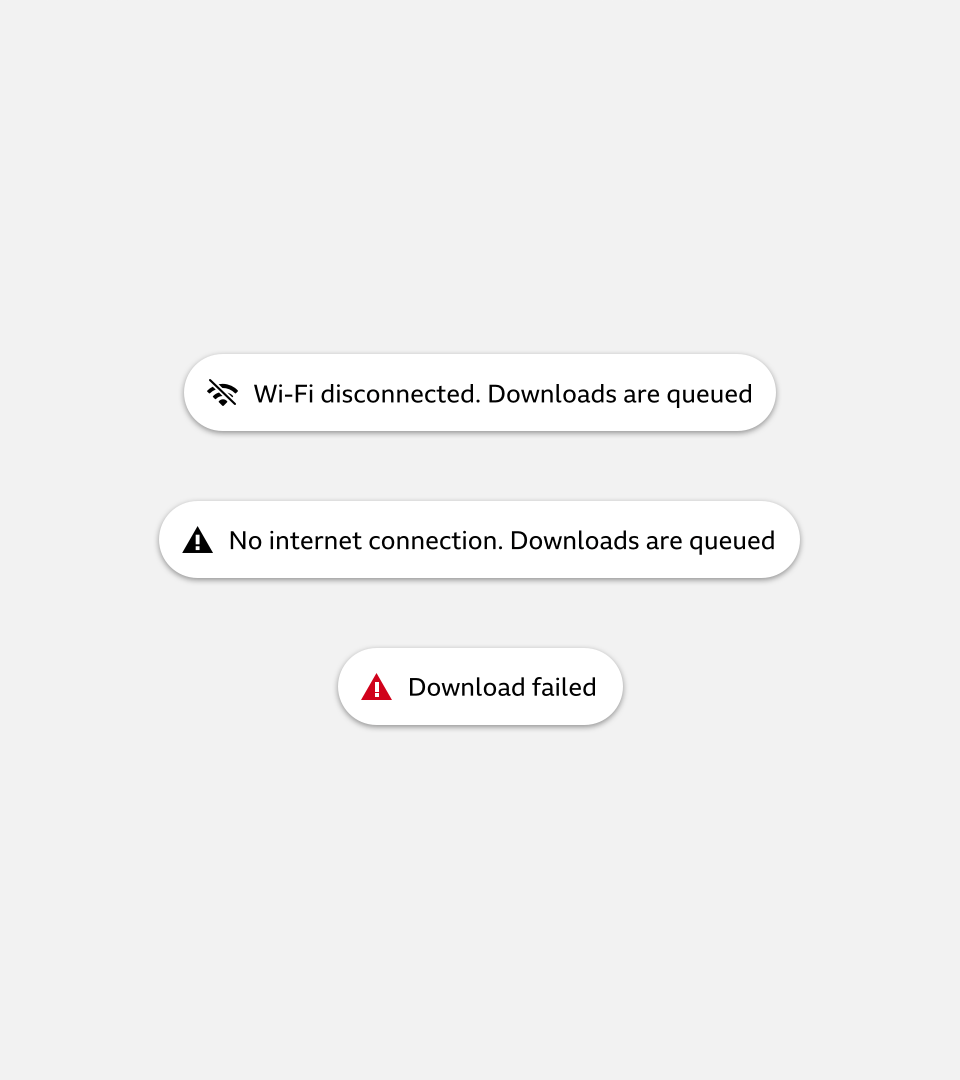
The scenarios:
A
WiFi Dropped
If you're downloading content and the WiFi connection is lost (and you haven't enabled download over data).
B
No Data at all.
WiFi and cellular connections have dropped. Downloads will be queued until you're back online.
C
Failed.
We'll let you know when something failed to download.
In & Out.
The global toasts eases in and stays on screen for 5 seconds. Users can swipe away or wait for it to automatically hide.
Either way, full transparency on their downloads is given.*
*We hope users don't have to see the toast to be honest.
In & Out.
The global toasts eases in and stays on screen for 5 seconds. Users can swipe away or wait for it to automatically hide.
Either way, full transparency on their downloads is given.*
*We hope users don't have to see the toast to be honest.
03
Download Space
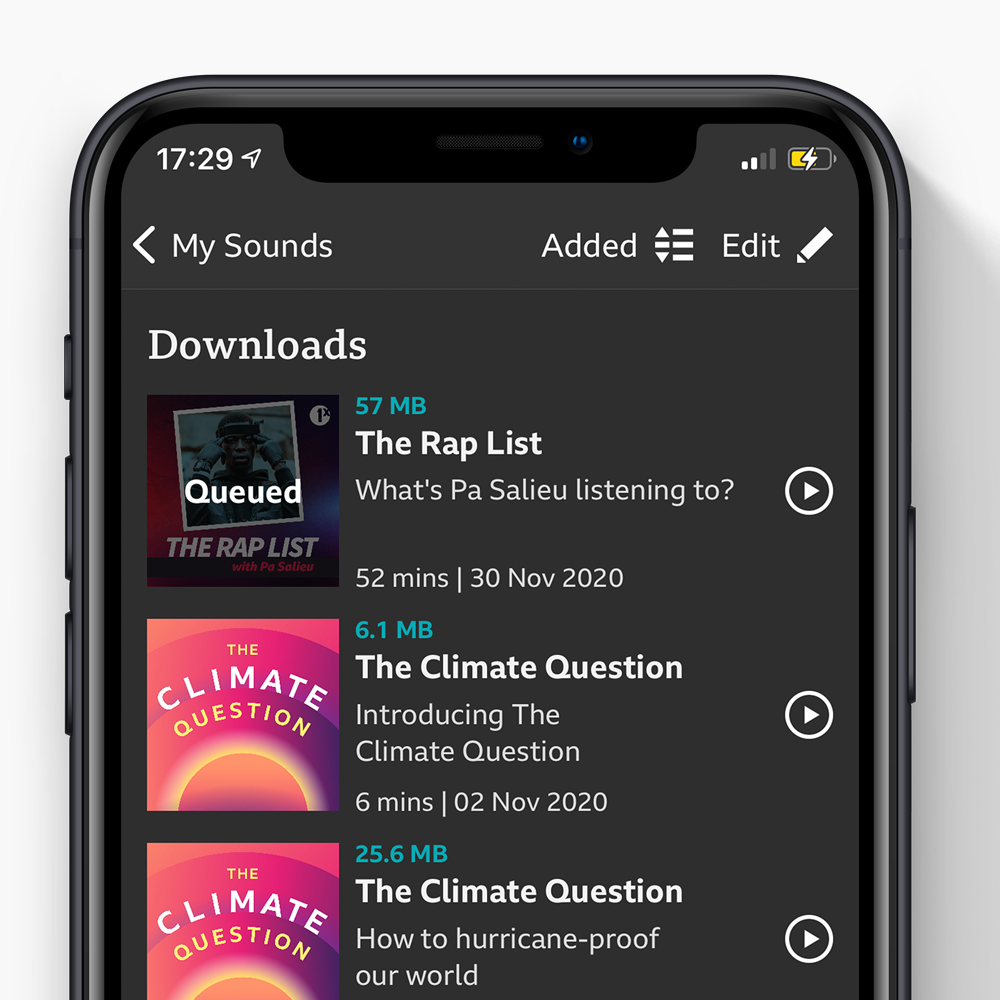
The home of your downloads. Whether queued, failed or ready to listen; all user's downloads live here.
Current experience.

Designs
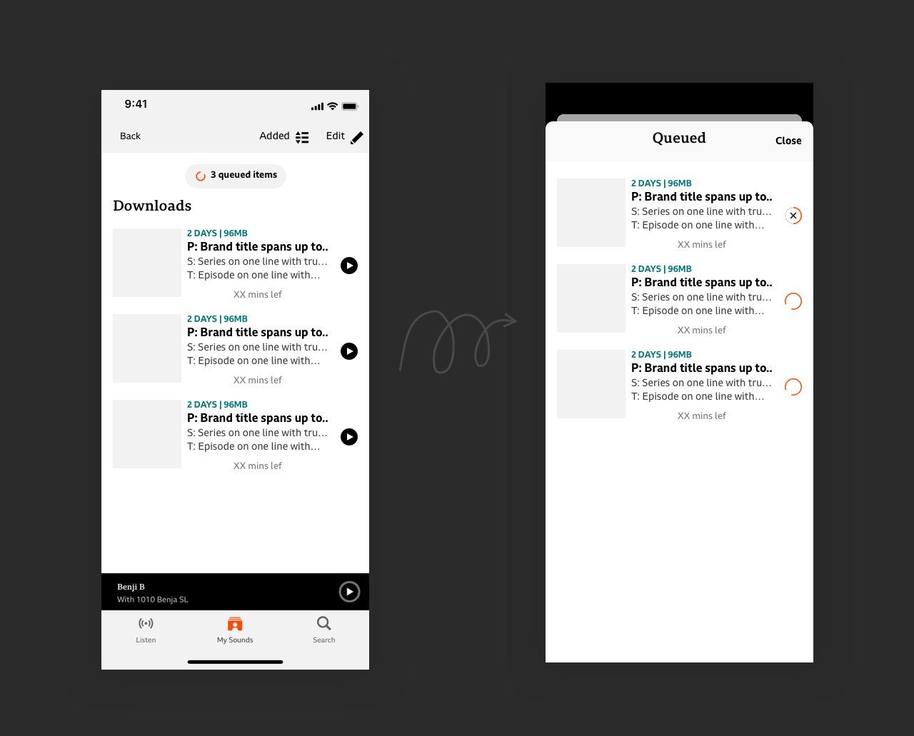
V1
Separation
Queued items would live in a modal that is accessed via a button in the downloads space.
Giving clarity between what's complete and what's not.
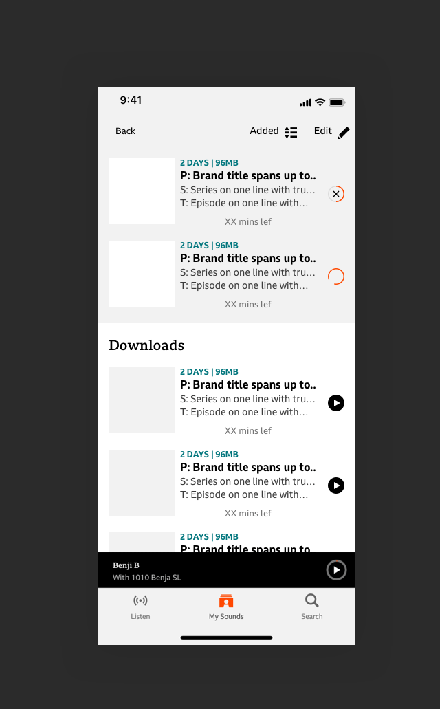
V2
Together
All downloads together regardless of what state they're in. Queued or in-progress items will be anchored to the top until complete.
Guerrilla-ish*.
We had a few insights from across the organisation on what works for our users. But not Sounds users.
Meeting 10 users (remotely**) to see which design best fit their needs.
*Guerrilla meets interviews.
** Pandemic
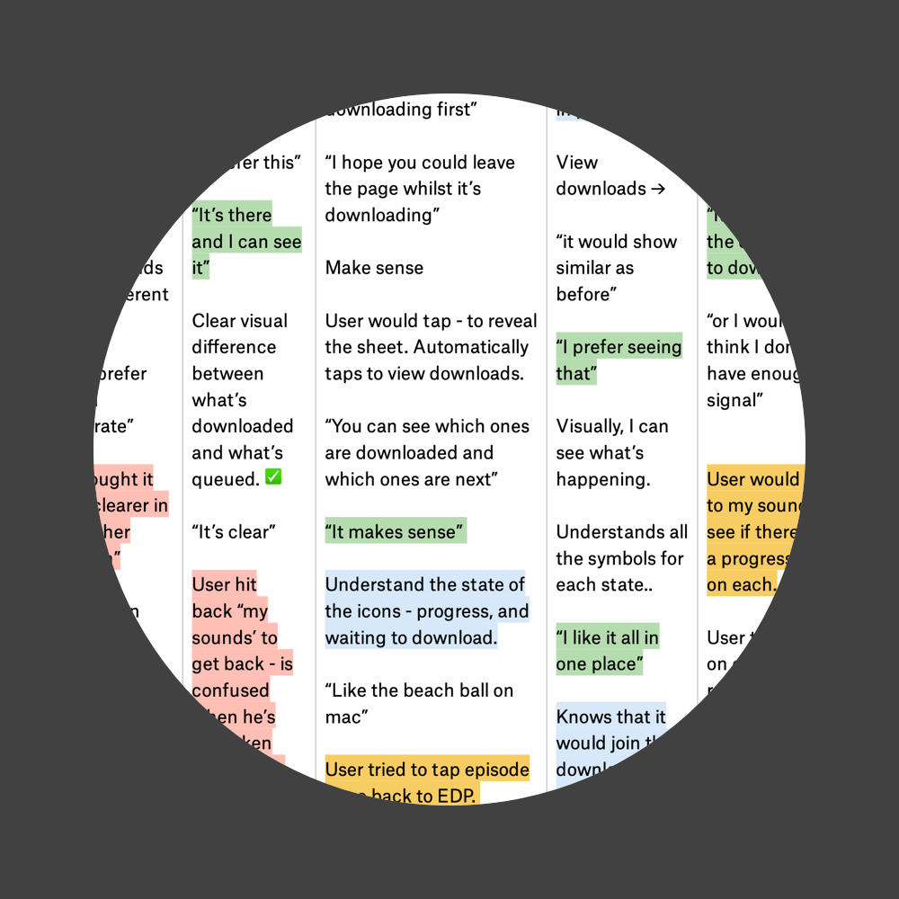
Takeaways:
01
Users liked being able to see everything in one view.
02
Less taps - the better.
03
People don't really use Action Sheets to navigate to downloads.
04
Queued animation conveys the intended message.
05
Users appreciated being asked if they wanted to download over data if WiFi isn't available.
06
Allowing users to jump into settings from contextual Action sheets is beneficial.
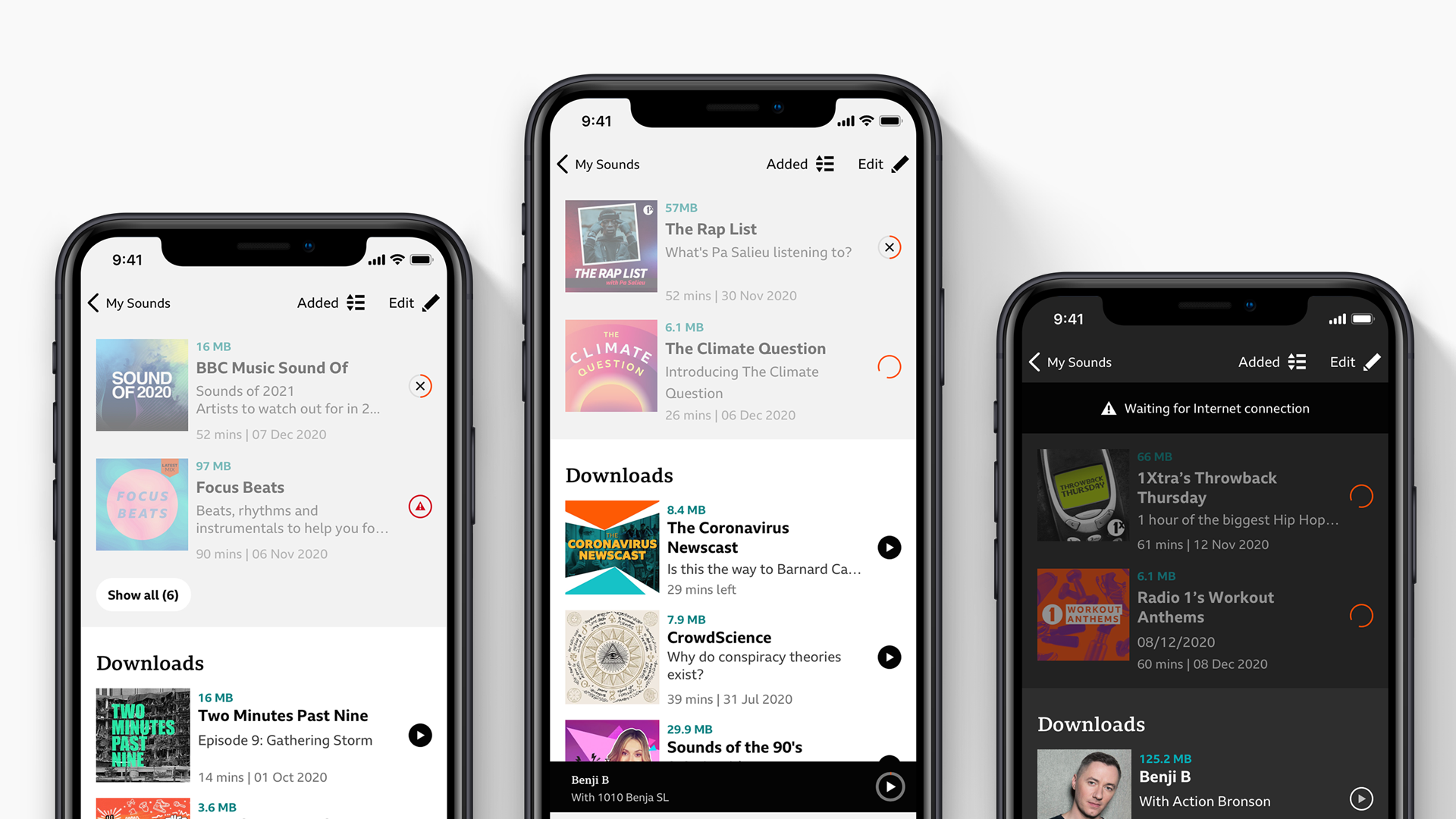
New downloads.
Clear visual difference between completed downloads and those in progress.
Users can no longer play content that hasn't downloaded. Full trust and transparency when we use their phone data.
Users can no longer play content that hasn't downloaded. Full trust and transparency when we use their phone data.
Cancel downloads instantly. No need to navigate back to the Episode detail page.
Downloads fully reflect the status shown on the EDP. Consistency and clarity.
Network status bar so users can undertand why their downloads queued when there's no connection.
Hurdles.
As with any project, we had a few bumps along the way. Here's a few we encountered.

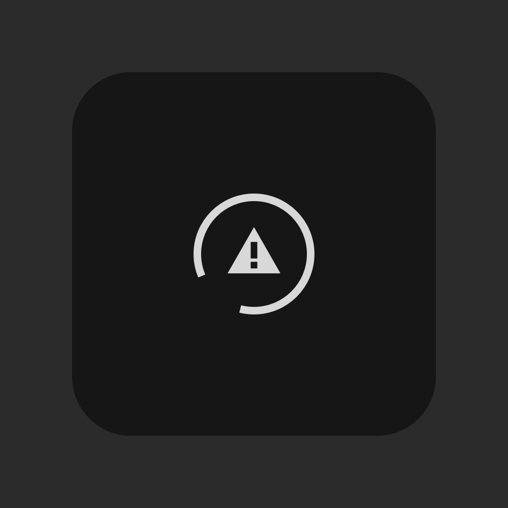


Established architecture for Android limited how users navigated between tabs.
Our downloads manager often has issues distinguishing between queued and failed downloads.
Some animations were not smooth on older devices. A quick pivot and a lottie animation sorted it out.
All during a global pandemic. Joining and working with a new team remotely.
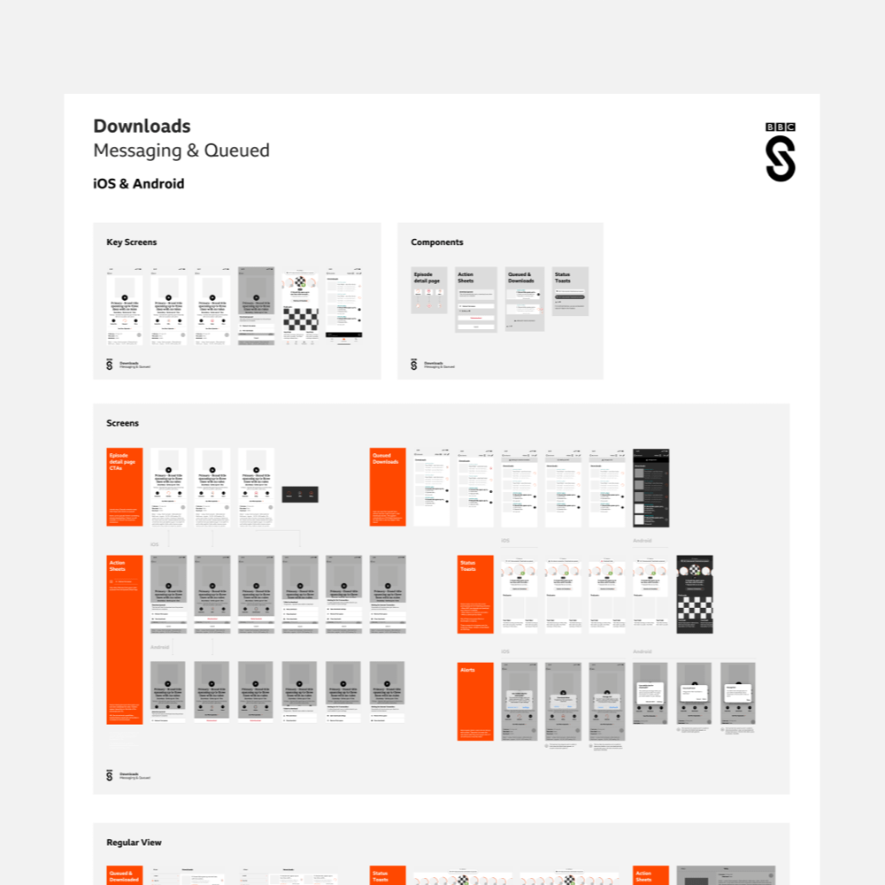
Handover.
This isn't an easy project to hand over. Working with fellow UX designers and Devs to understand the best way for us to not just hand over designs, but show the whole experience.
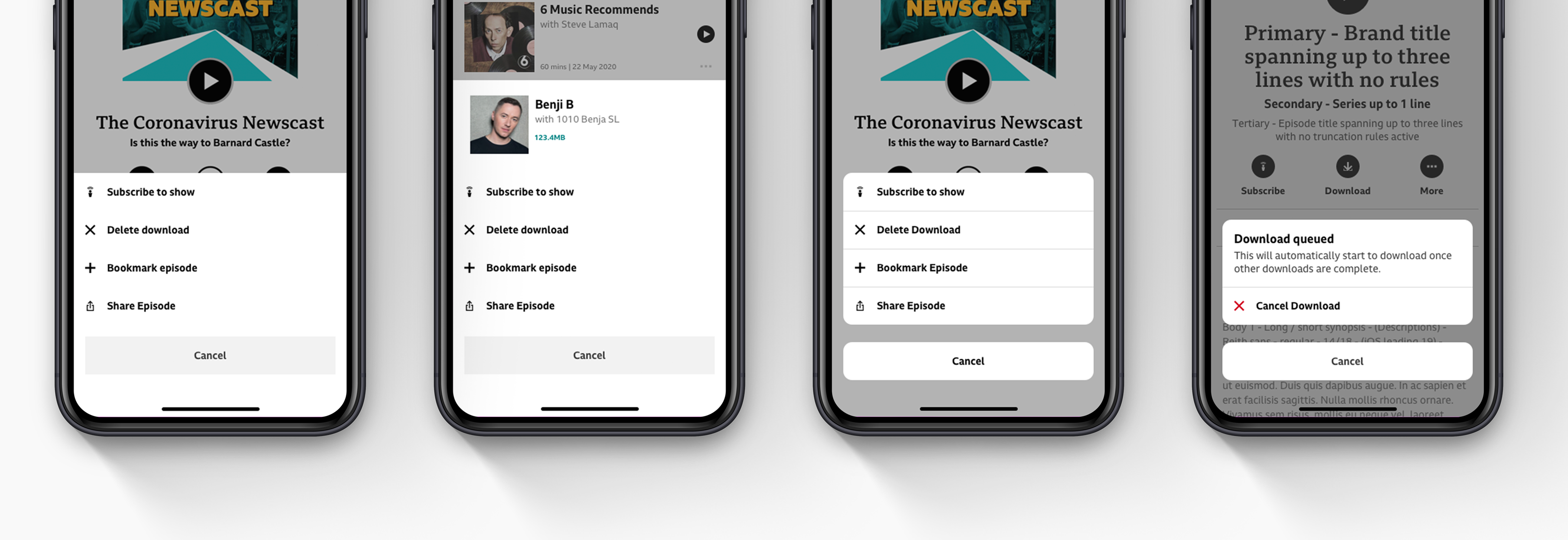
Some action.
During this piece of work I saw an opportunity to improve the UI of our action sheets. Making them align with the gradual UI improvements. Here's some explorations.
